Data Visualization
Default Settings
In the left module's navigation, you'll see a submenu item under "Main Settings" labeled "Activity Charts". That page lets you choose your default settings for this visualization type. Depending on the forms and data set you're working with, this page can help cut down on the configuration time needed to set up a new Activity Chart.
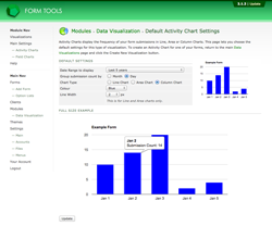
The screenshot to the right shows a typical set of default settings. The page contains two example visualizations: a thumbnail-sized one (which gives you an idea of what it will look like in the Quicklinks Dialog) and a larger, full-size visualization. The actual data being graphed on this pages is just dummy data. Try changing some of the settings: the visualizations in the page will automatically update to reflect your settings. This is a nice, visual way to choose your settings - so you know what you're actually getting!
Google Charts does its best to display the data in as clear a manner as possible, so, when creating smaller visualizations it may reduce the total amount of information shown (such as the number of columns, rows or labels). Once you start creating your own visualizations, you'll find that you'll get a sense of this and construct them accordingly.
Here's what each of the settings on this page mean.
| Date Range to display | This determines the time period to include in the graph. There are a lot of options, but bear in mind that the larger the duration, the slower the visualization will take to load. |
| Group submission count by | This lets you group together the activity county by day or month. If you've selected a short period to graph (e.g. the last week), it wouldn't make sense to choose "month" here. Likewise, if you chose to display a year or more, you wouldn't want to select "week" in this field. |
| Chart Type | Activity Charts can be displayed as Line Charts, Area Charts or Column Charts. Click on each on to see what they look like. The next page also shows each one. |
| Colour | This controls the default colour of all Activity Charts. |
| Line Width | This final setting is relevant for Line and Area Charts only: it controls how thick the top line is. |
