Data Visualization
Creating an Activity Chart
Okay! Let's create a new Activity Chart.
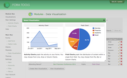
Select the Data Visualization module from the Modules page in the Form Tools administration section. There, on the first page you get redirected to, click the "Create New Visualization" button. A dialog window will appear that looks like the screenshot to the right. To make it as clear as possible, the two visualization types are clearly marked. Click on the "Activity Chart" image on the left.
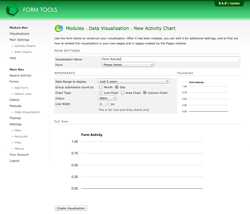
After you click it, you will be redirected to a single page where you can configure your new Activity Chart. Like with the default Activity Chart settings, the page contains two sample visualizations: thumbnail and full size.
The screenshot to the right shows how the page looks before setting any values. Here's what each of the settings mean.
Main Settings
| Visualization Name | This is used to identify this visualization. It's used in the module when browsing your visualizations, and in the visualizations themselves to provide a title. |
| Form | This determines which form submissions you wish to visualize. |
Appearance
| Date Range to display | This determines the time period to include in the graph. There are a lot of options, but bear in mind that the larger the duration, the slower the visualization will take to load. |
| Group submission count by | This lets you group together the activity county by day or month. If you've selected a short period to graph (e.g. the last week), it wouldn't make sense to choose "month" here. Likewise, if you chose to display a year or more, you wouldn't want to select "week" in this field. |
| Chart Type | Activity Charts can be displayed as Line Charts, Area Charts or Column Charts. Click on each on to see what they look like. The next page also shows each one. |
| Colour | This controls the default colour of all Activity Charts. |
| Line Width | This final setting is relevant for Line and Area Charts only: it controls how thick the top line is. |

