Checkboxes
Checkboxes
Checkbox fields are identical to radio button fields in all but one way: they are checkboxes, not radios! (Well, duh). But the point is, they have exactly the same settings and options as radios. Checkbox fields in 2.1.0 work essentially the same as with earlier versions. As with radio buttons and dropdown fields, checkboxes need a data source: i.e. the options used as the checkbox list. Like before, those options are defined in Option Lists (formerly called "Field Option Groups").
So, when you change a field type on the Edit Form » Fields tab from (say) a textbox to a checkbox group, you also need to edit the field in the Edit Field dialog window and assign the data source.
In the Edit Field dialog, there are three available options:
- Option List / Contents: this field is required. It specifies the data source for the radio buttons. You have two choices: either use an Option List, or use the values pulled from a field from another form. This later option is quite exciting: it effectively lets you tie together two separate forms. Any time a new submission is added to the second form, the value in the field you specify will be included in the list of radio buttons displayed by this field.
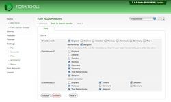
- Formatting: this is best illustrated in the screenshot at the top of the page. It gives you a little control over how the radio buttons are displayed. The options are: horizontally (one next to the other), vertically (one above the other), or in 2, 3 or 4 columns. These latter options really help present the radios in a clear format.
- Field Comments: as with the other field types, this setting lets you add a comment to appear underneath the field.
